What makes a great Image Editor like Pixlr and Snapseed?

Original Image Not Edited

In today’s blog post, I will discuss my image editor experiences using two great tools, one for desktop and one for mobile.  Photography is a thing of beauty.  You can either capture a moment or stage a moment. And the fun part that comes after is editing that moment.  The figure to ground picture above is the original un-edited photo of me modeling a brand new, unworn pair of the retro Air Jordan 6 Maroon model.

Pixlr edited photo
Pixlr edited photo

Image Editor: Pixlr 

I was playing around with this desktop image editor called Pixlr and was quite amazed with what you can do to modify/enhance an image.  The first thing I did was add the iconic Air Jordan “Jumpman” logo that I found on Wikipedia.  You can do this by adding an image into an existing image under the Adjustment tab followed by clicking on the Add Image option.   I then added a maroon colored text description of the shoe by selecting the Type icon which has a variety of fonts to choose from. I selected the Sans category and chose a simple Roboto font to work with.

Next, I added this light rising sun looking filter to the image by clicking on the Overlay option and picking the Retro poster -> Beam filter at 40% usage.  Finally I had to make this image look straight fire, so I went back to Overlay, clicked on Flame -> Gap and now my image is the hottest looking thing since sliced bread!  Overall it was a great experience playing with this desktop editor, I definitely recommend it to anyone looking to boost or play around with your images.
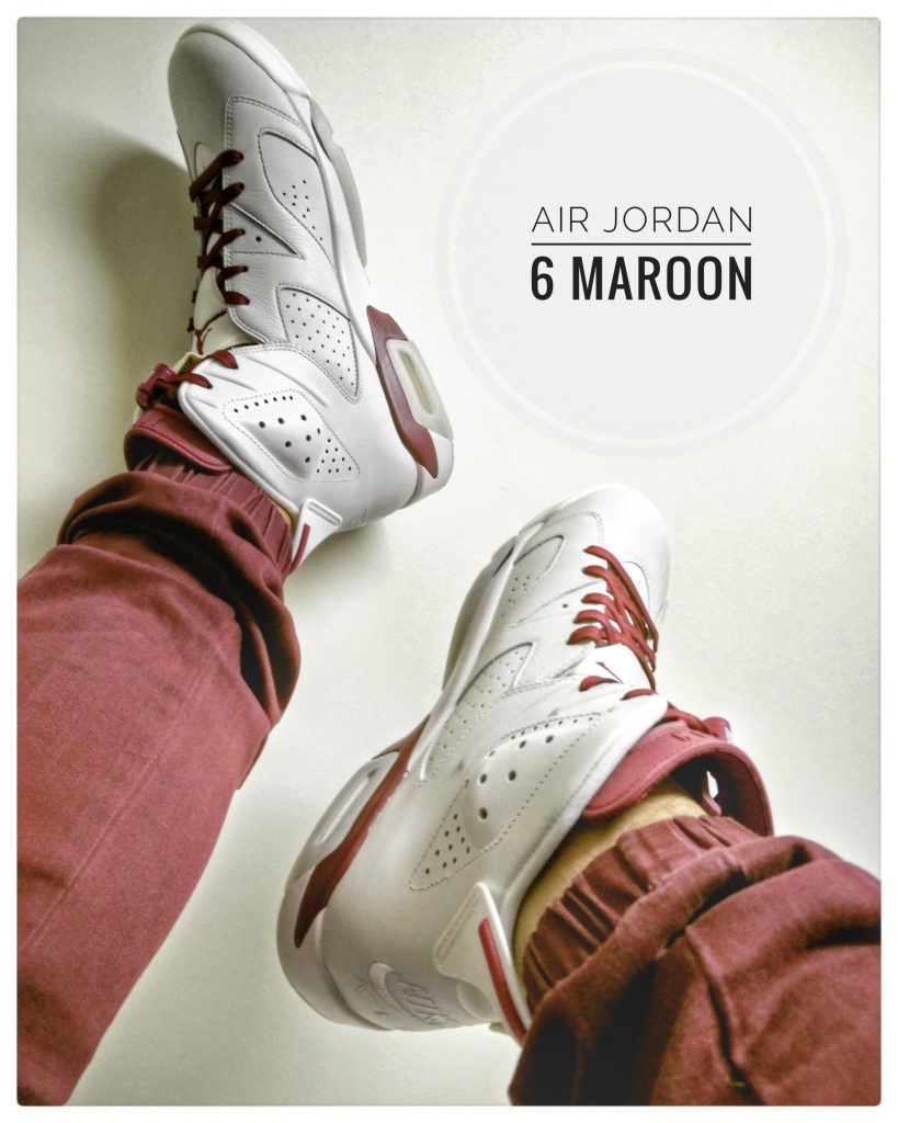
Snapseed edited image

Image Editor: Snapseed

I downloaded the Snapseed app to my Android phone and started to tinker with the image.  I wasn’t looking to do much with this image and kepy it simple and polished.  The first thing I did was add a white, inside curved border around the image.  This can be achieved by scrolling down to Filters -> Frames section and selecting the first option of 23 available.  I then applied a HD looking filter for a lighter feel.  I went through the path of Filters -> HDR Scape -> People to get this look.  Finally, I added a pre-made button with some text to describe my image.  Under the Tools area, I clicked on Text, chose the option called N3 and modified the text inside with a lighter gradient in the background.  Overall I was happy with this mobile image editor.  It definitely comes in handy when you’re on the road and you want to tinker with some of your shots.

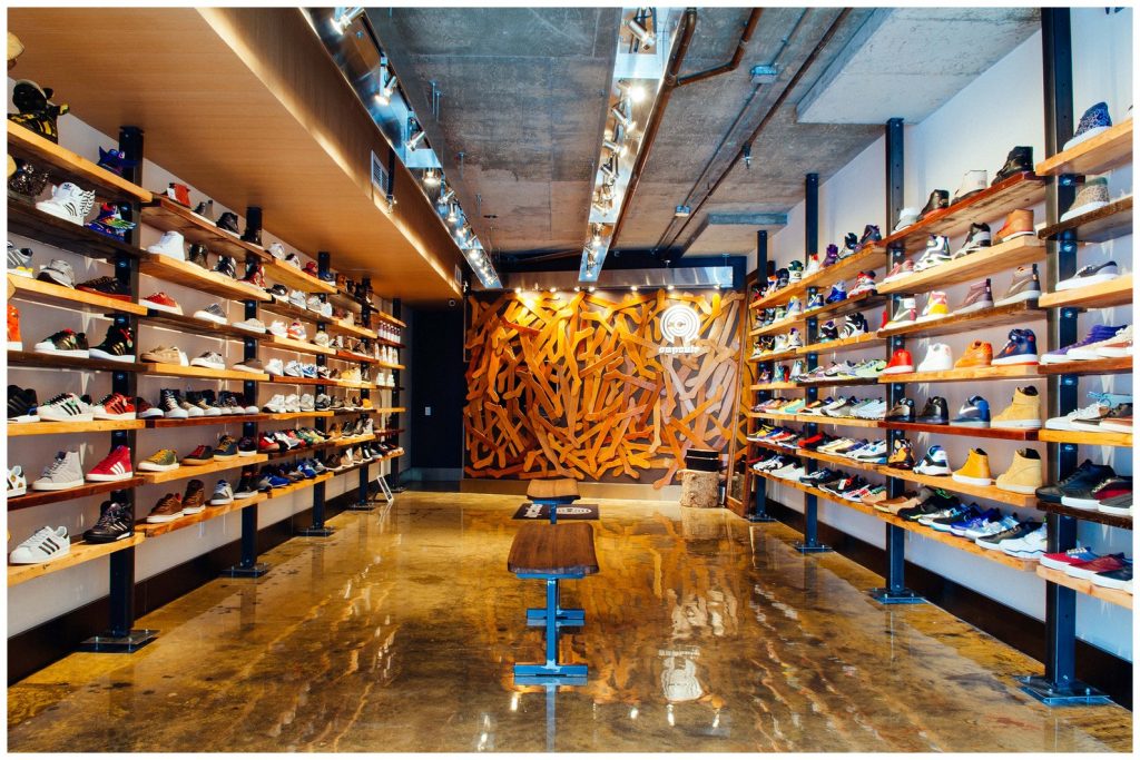
Image Composition Ideas for Capsule Toronto Instagram

Capsule Toronto
Capsule Toronto

Visuals sell product

Capsule is a recognized sneaker boutique based in the Toronto area.  The 16-year old company has built a reputation for their consistency in carrying the most popular shoe brands, complimented by the latest and emerging street wear brands on the market.  Capsule has been known to have line ups for days leading up to a highly anticipated product release. They have 3 locations in the Yorkville (including a show room) and Markham area to better serve the GTA.  Their target market focuses on the 18-34 age group, who are fashion forward minded consumers.  The following 3 image composition shots that will be discussed below in this blog post are suggested visual ideas, to promote and sell products for their Instagram account, which has over 20,000+ followers.

Image Composition 1

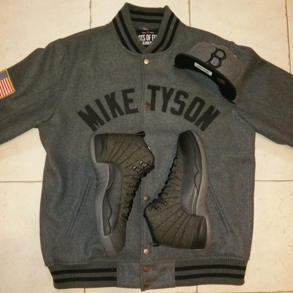
Knolling your role

This image uses the popular knolling composition, which is an overhead view display that gives the viewer a great look at 3 different products.  This would be a great look for Capsule, simply for the fact that their customers are always looking for a combination of ideas on how to integrate their wardrobe from head-to-toe.  The jacket provided is by Roots of Fight, an apparel company that celebrates vintage sports icons, the hat is a retro Brooklyn Dodgers cap from New Era and the Jordan Brand shoes are the iconic 1996-1997 Air Jordan 12 model.  The common denominator between all 3 black/grey colored products is that they incorporate wool material, which is an appealing look for the current fall season.

Camera: OnePlus 1 smartphone
Image Size: 840 x 840 pixels
Filter: None
Lighting: smartphone flash
Suggested Hashtags: #rootsoffight x #miketyson x #brooklyndodgers x #brooklynsown x #airjordan12wool x #airjordan12 x #wearejordan x #hatclub x #wool x #fallfashion x #swag x #baddestmanontheplanet x #jordanbrand x #jumpman23 x #knolling

Image Composition 2

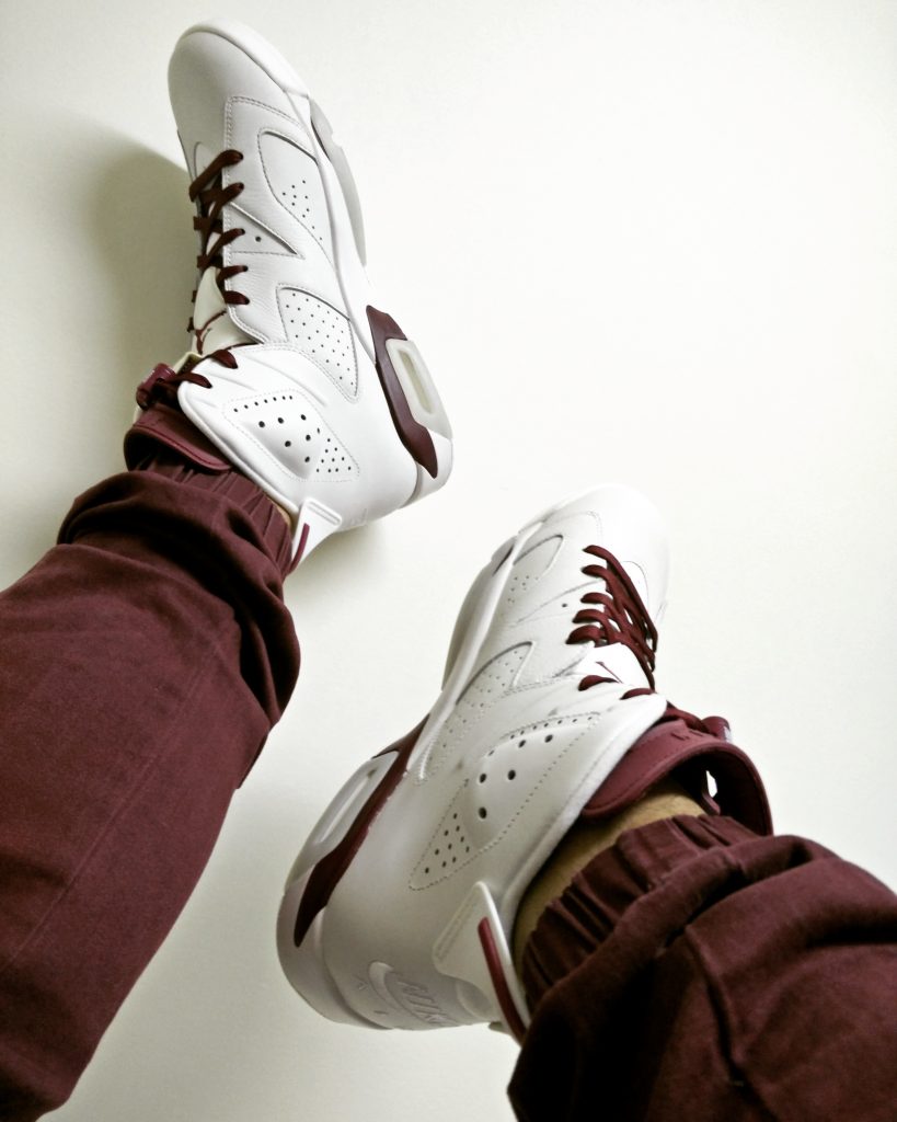
Figure to ground image composition

One of the most popular nicknames a shoe collector is often referred to is a sneakerhead.  And one of their most popular hashtags that they use on social media to define their shoe collection is known as shoe porn, a playful term which has an addictive connotation to it.  If there could be a satirical composition to describe the image, it would have to be POV!  In all honesty, Figure to ground is the primary composition.  This shows the product on foot which is the Air Jordan 6 Maroon model, originally released in 1991-1992.  The Ludwig filter from Instagram was applied to brighten the image of the shoe.

What we see here are two clean primary colors in white and maroon, which is another fall season tone.  The secondary product in this shot is the Zanerobe jogger pant, which is a must have item for fashion enthusiasts.  The stand out feature is their cuffed bottom that prevents the tongue of any high top shoe from being hidden from a pant leg hovering over.  While this image is clean and polished, it also serves as a double meaning with a fashion tip as well.

Camera: OnePlus 1 smartphone
Image Size: 819 x 1024 pixels
Filter: Ludwig (Instagram)
Lighting:  Natural room lighting
Suggested Hashtags: #airjordan6 x #airjordan6maroon x #jordanbrand x #wearejordan x #zanerobe x #joggerpants x #streetwear x #burgundy x #maroon

Image Composition 3

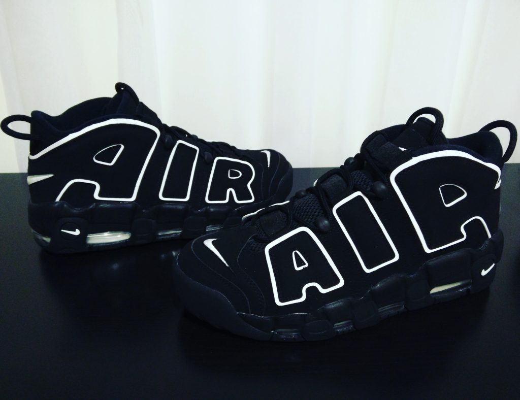
It’s 1996 all over again.

This black and white image portrait features one of Nike’s most iconic shoe designs.  The Nike Air More Uptempo shoe originally released in 1996.  The shoe saw a retro re-release brought back in spring 2016.  This model is widely known for its large “Air” logo design, surrounded by black synthetic nubuck material. Image composition uses a simplistic approach, with a clean and polished visual.  Capsule has built a reputation for its visual simplicity in their Instagram posts.  The popular Clarendon Instagram filter was applied to brighten and intensify a popping color image effect.  This visual fits in line with the brand’s desire to produce eye catching imagery through their social channels.

Camera: OnePlus 1 smartphone
Image Size: 840 x 646 pixels
Filter: Clarendon from Instagram
Lighting: Natural room lighting
Suggested Hashtags: #nikeair x #nikeairmoreuptempo x #scottiepippen x #retrokicks x #oldschoolkicks x #igsneakercommunity x #blackandwhite x #clarendon

Two Images that capture Visual Communications

Visual Communications
Visual Communications image courtesy of LinkedIn

Throughout this past decade, we have seen the emergence of various applications on our smartphones that we cannot live without.  One of them in particular is Instagram, which is one of the most popular apps used in the world right now.  Simply known as IG or sometimes The ‘Gram, this visual communications platform is recognized for its ability to tell stories.  This has now become a destination for businesses to build brand awareness and identity in selling products and ideas.  The following two images selected below I will deconstruct the meaning behind them and the message they attempt to convey.

Visual Communication Image 1

This image instantly triggers an emotional reaction.  Samsung has provided a snapshot of what almost every single person does when they wake up…Get some coffee and check their phone.  It’s a highly likely universal practice among students and working class.  The color describes the feel that this could be at home, at the cottage, a workplace table or even a coffee shop environment.  The coffee design in the cup paired with two phones in the image denotes maybe this is something a couple would do, browsing their phones in the AM.  Samsung connects the audience with a relatable practice and introduces their latest smartphone model for consumption.

Visual Communication Image 2

https://www.instagram.com/p/BJdTLGED2A1

I believe adidas got it right with this ad. Their purpose is to sell shoes and the imagery shows the product in motion, in branded uniform for that matter. The gloomy color in the photo paints a picture that their products are what you need, regardless of the weather conditions of any given day. The caption in the post also adds as a narrative using the word “steps”, as the actual image has multiple stairs as the backdrop. The image also creates the idea of team unity as well. They sell an overall theme of  fitness and travelling on a path to success integrated into this post.