

We are evolving with the way we read.
In this digital age that we live in today, we are constantly looking at information in a variety of ways. They are posted everywhere – in books, magazines, newspapers, billboards and more. In the last 10+ years, we have seen a marketing shift from traditional print to digital. We consume information not only on our desktop computers and laptops, but now more than ever through our tablets and smartphones. With the rise with Infographs, we can learn a lot more and absorb insightful information.
While many rely on traditional methods of reading and learning, Visual Communications has grown tremendously that provides a great deal of information retention. But what exactly is Visual Communications? Here is the Wikipedia definition in a nutshell:
The Rise of the Infograph
We are constantly looking for information to better our knowledge. With knowledge comes better learning outcomes, which means faster and easier ways to retain information. Enter the Infograph, which is a visual image in the form of a chart or diagram that is used to present information and data. Check out some interesting stats on the benefits of having Infographs:
- High quality infographics are 30x more likely to be read than text article
- 40% of people respond better to visual information than text
- Infographs help increase SEO, which results in higher search engine rankings and more visitors to your website
- 36.4% click on the first link
- 12.5% click on the second link
- 9.55% click on the third link
- They are simply more engaging
- Helps you process information faster
- Researchers found that color visuals increase willingness to read by 80%
- People remember 80% of visuals that they see rather than 20% of what they read
- Infographics can keep customers on your website longer
Infographs are visibly more appealing and are easier to the common eye. Anyone with a Photoshop like program can get in the fun and create their own. In recent years, a company like Canva has made it easier than ever to produce quality designs and share online. You don’t have to be professional graphic designer anymore to build a great visual communication.
5 Helpful Tips on designing a great Infograph
1) Create your infographic for your target audience
2) Strive for simplicity
3) Use imagery and less text
4) Use white space, not a distracting background
5) Build to share on social media platforms
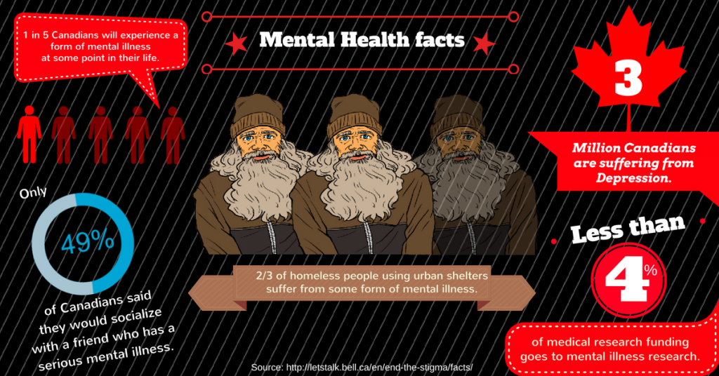
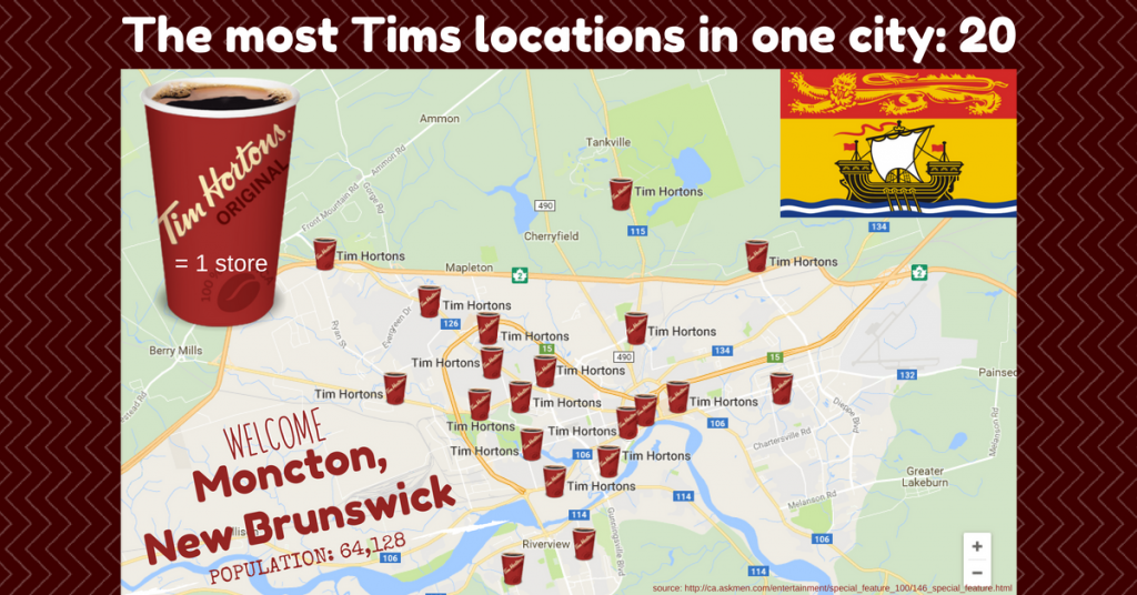
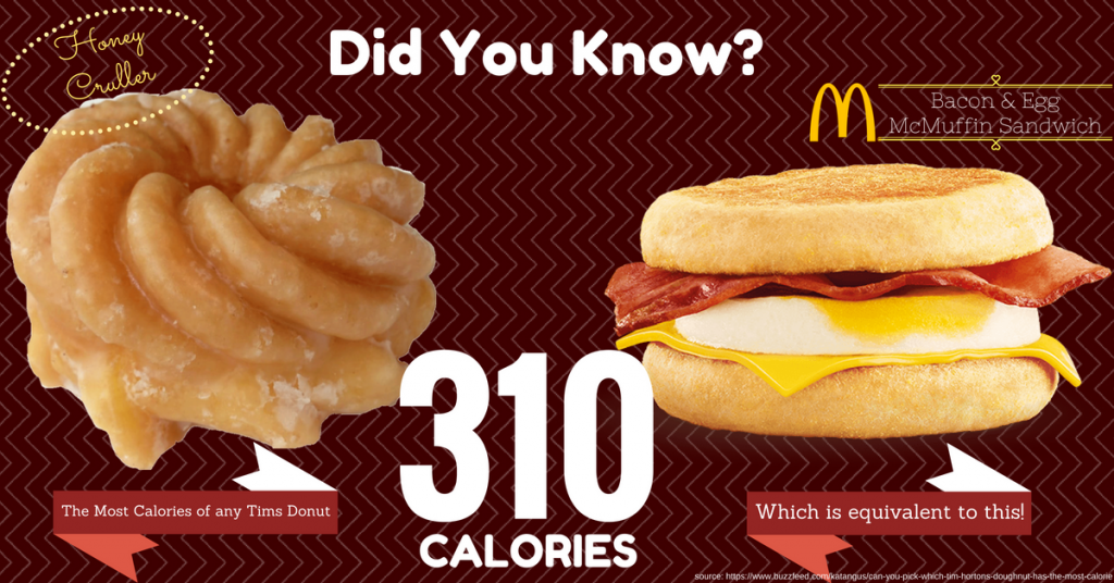
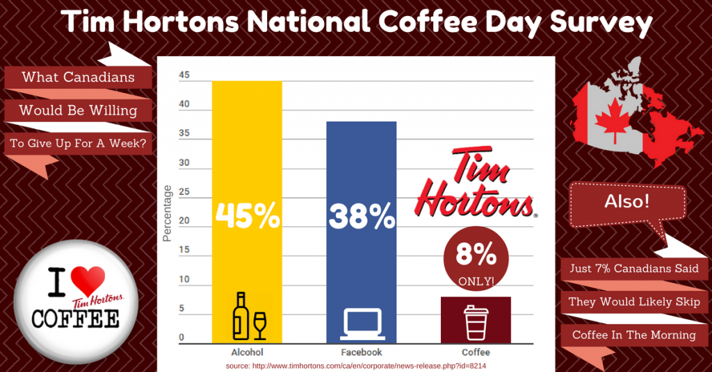
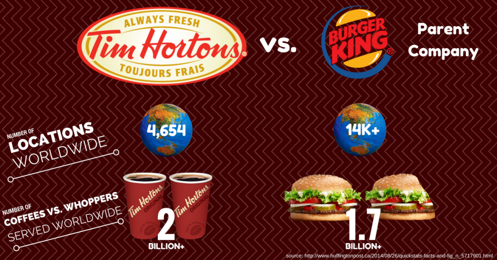
Having that said, check out five Infographs that I have put together, with Tim Hortons as the subject matter.

Resources
Doern, Bill. Visual Skills For Social Media. Seneca College. N.p., 5 Nov. 2016. Web. 31 Jan. 2017.
Maskeroni, Alfred. “Infographic: 13 Reasons Why Your Brain Craves Infographics.”Adweek. Adweek, 19 Feb. 2015. Web. 31 Jan. 2017. <http://www.adweek.com/creativity/infographic-13-reasons-why-your-brain-craves-infographics-163042/>.
“5 Reasons Why People Love Infographics.” Outreach Media. Outreach Media Group, n.d. Web. 31 Jan. 2017. <http://outreachmediagroup.com/5-reasons-why-people-love-infographics/>.